Project 1
Kirubai Clinic Banner
Street-board revamp — before and after
Overview
Large-format board for the clinic: clearer information hierarchy, calmer lettering, and a more confident layout so it reads at a distance.
Before & after


02.2 / Graphic design
Projects 1–4 on one page — same layout and rhythm as UX UI Shorts, stacked in order.
Project 1
Street-board revamp — before and after
Overview
Large-format board for the clinic: clearer information hierarchy, calmer lettering, and a more confident layout so it reads at a distance.
Before & after
Project 2
Building signage — outside & inside
Overview
Branded boards for the Infinex Corporation location: a clear read from the approach (outside) and a consistent, professional presence in the interior.
Outside & inside


Project 3
The Centre for Special Education — tri-fold brochure
Overview
Tri-fold brochure for The Key — The Centre for Special Education (Chennai, Vadapalani), plus exterior signage. Navy, gold, and white, with student and classroom photography and a script logotype. Messaging leads with care: help every child unlock potential, with services from assessment and IEPs through instruction, parent–school collaboration, behaviour strategies, advocacy, professional development, and family support. Contact: No. 4/6, Thirunagar 5th St; +91 98409 80958; contact@thekey.school; www.thekey.school. The sign board extends the same identity to the approach.
Brochure and signage


Business card


Project 4
Packaging identity for masala & health mix
Overview
Branding and print touchpoints for Essence of Asia — a masala and health mix line: logo and business cards with a food-forward, wellness-led presence.
Logo

Business card


Project 5
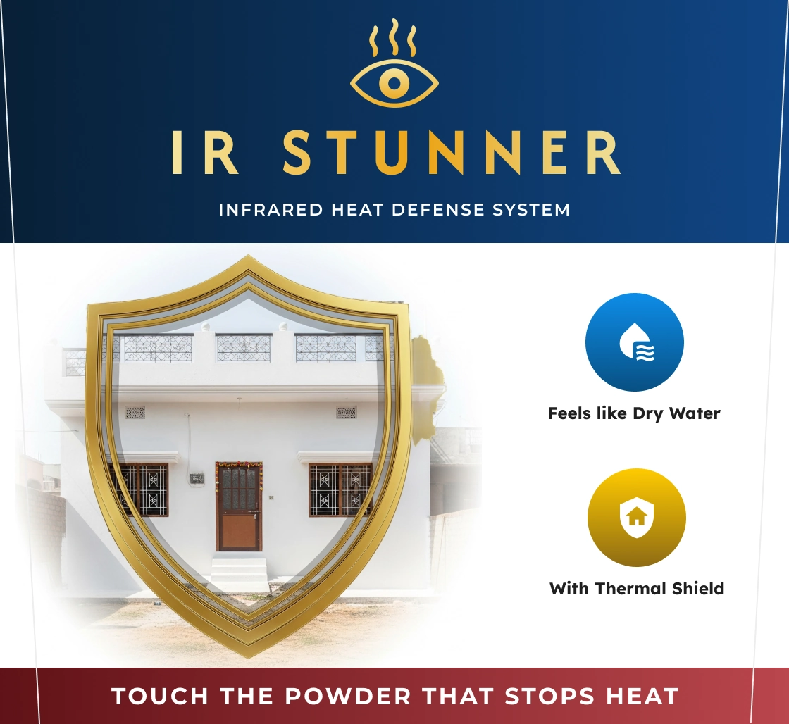
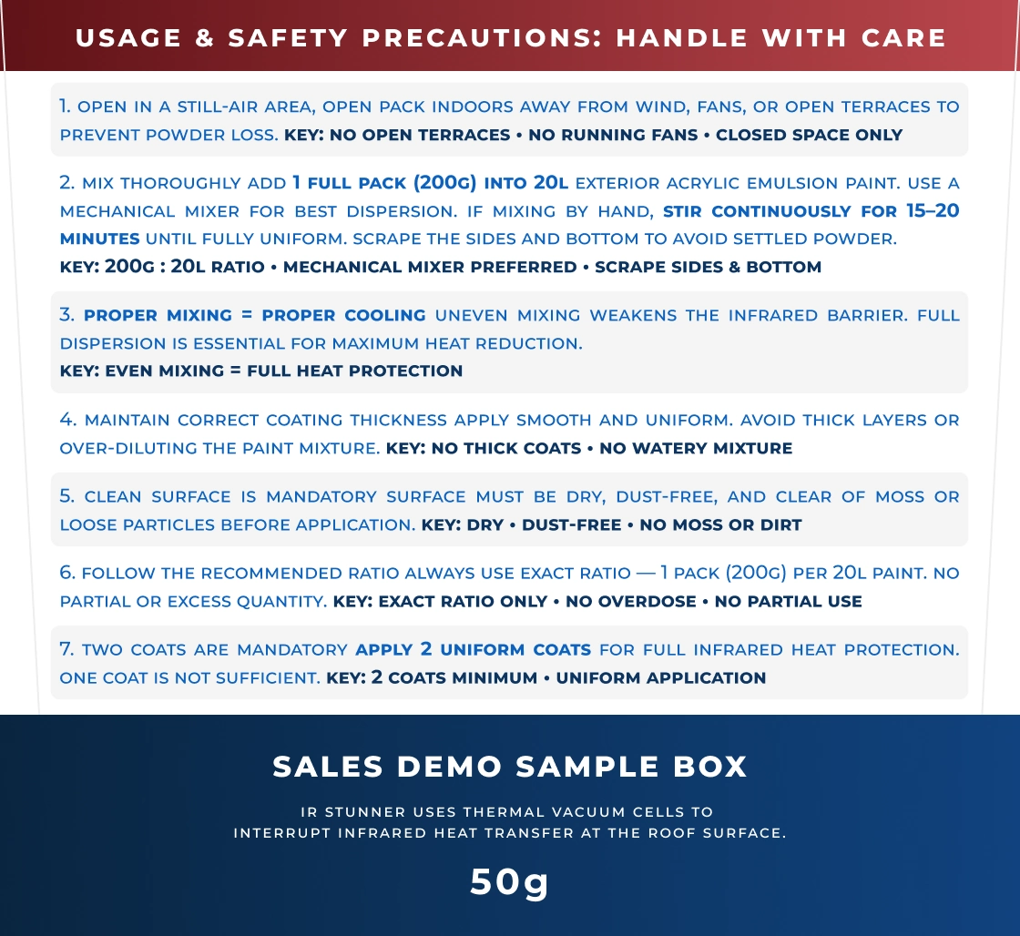
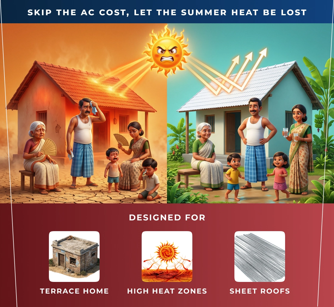
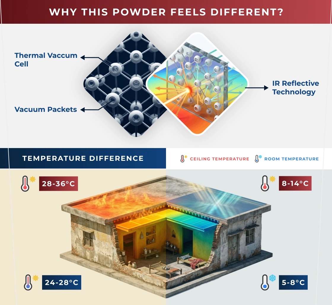
Packaging design · thermal shield powder for factory & home roofs
Overview
A powder mixed with paint so factory and home roofs act as a thermal shield — cutting radiant heat before it enters the building. The design goal was trust: credible numbers, a consult-first CTA, and packaging that reads cleanly in-store and in photos. Two distinct entry points — Industrial and CHILL HOME residential — so each audience sees only the story relevant to their roof.
Packaging & product
Marketing & sales / impact
Sales growth (summer, WhatsApp-led)
15% → 40%
Core CTA
WhatsApp + on-site audit
Split positioning
Industrial · CHILL HOME
Sales motion
Specifiers → field trials
Channel focus
Consult-led, not paint upsell