Case study
Vidya's Kitchen
Mar 2026 — Present
Home catering · Sivakasi
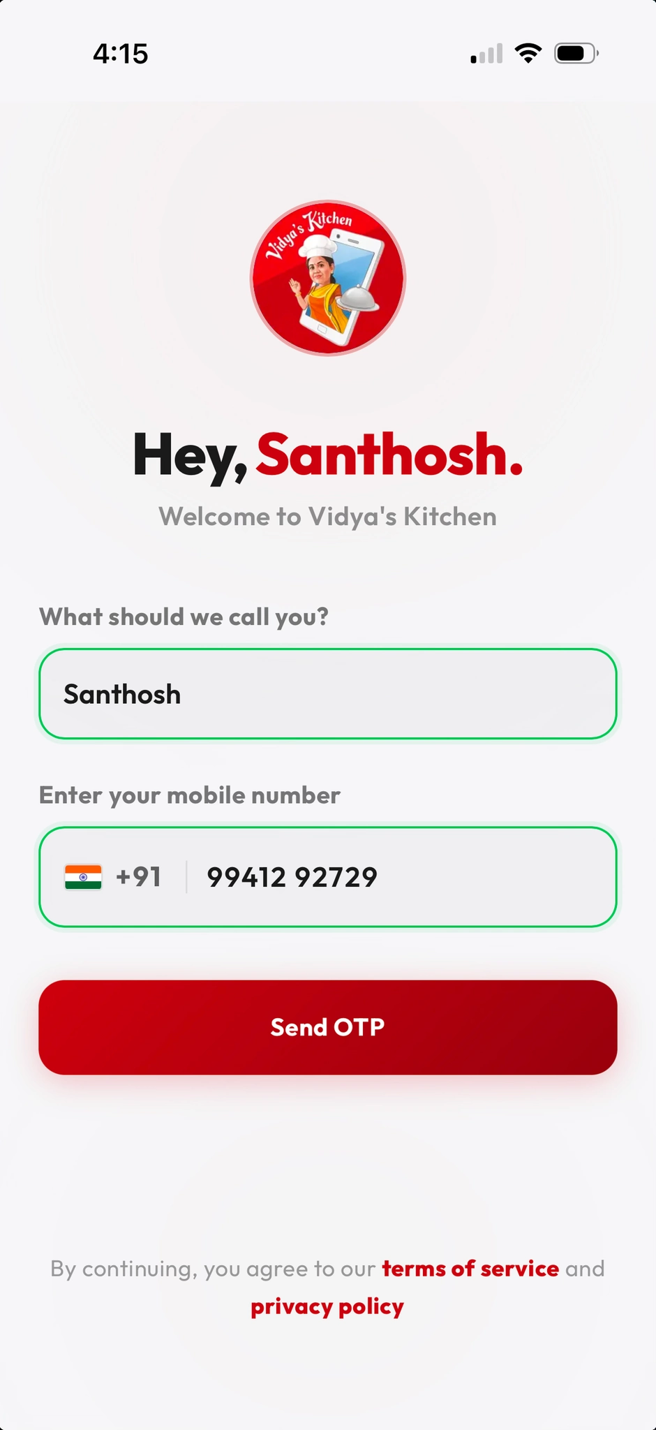
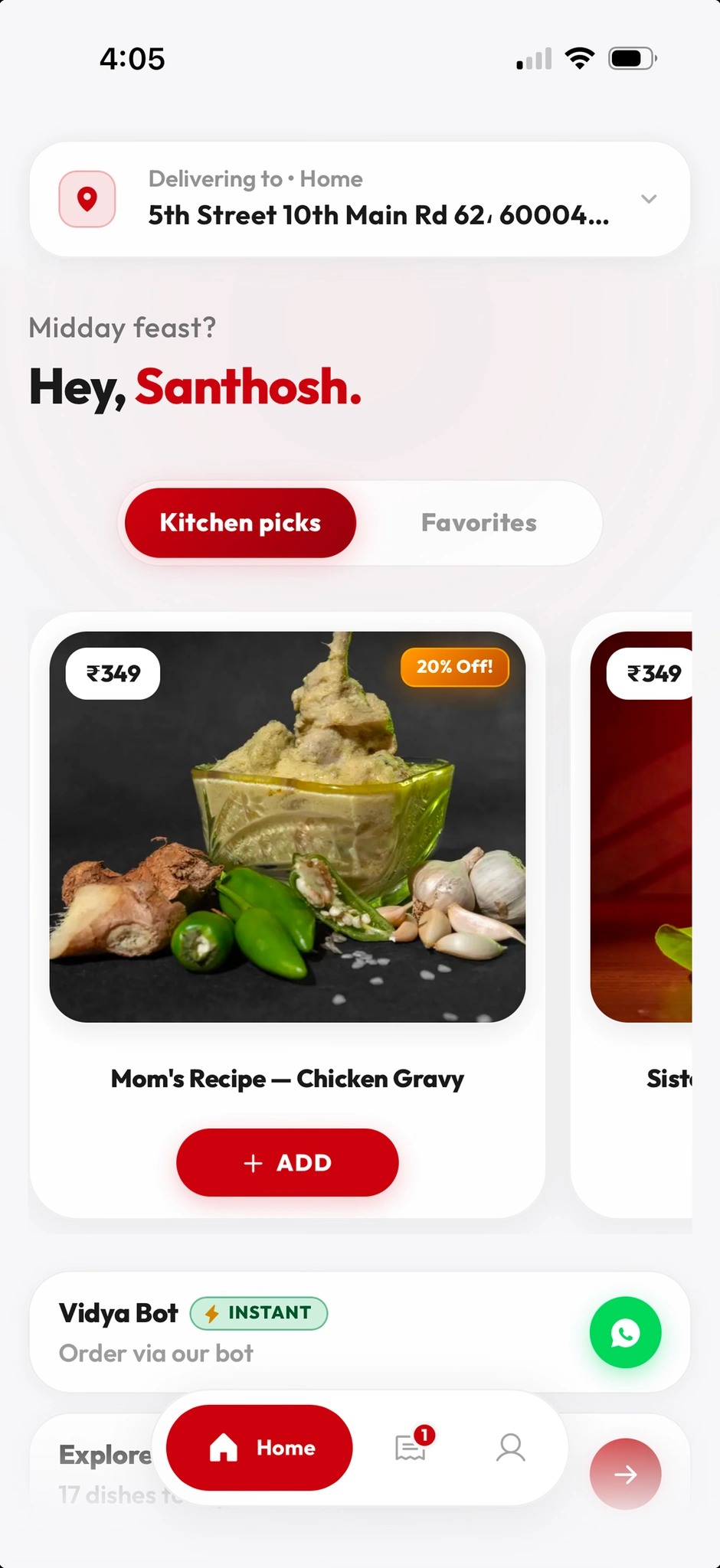
The first home-catering product in the region with a premium app-like PWA, a WhatsApp ordering bot, Razorpay checkout, and an operations dashboard—built so a Sivakasi home kitchen can scale beyond word-of-mouth like a small cloud kitchen.
A home cook in Sivakasi was already serving her network, but to grow she needed a real digital system—not a generic menu PDF. Nothing similar existed locally as a first-class experience: no regional benchmark for a premium UI, a WhatsApp-native path, and a way to run payments and delivery without turning the kitchen into an admin job.
Design and ship an end-to-end system: marketing touchpoints (Instagram, video ads) that push leads to WhatsApp; a bot that can take structured orders; Razorpay for payment; a PWA with installable, app-grade UI; and a dashboard to accept orders, update the menu, and track drivers. Align the first version to a business goal of roughly ₹1–2L/month as the offer stabilizes. For me, this was also the project where I moved from UX/UI alone into vibe-coding the product in React and TypeScript.
2.1 · UX process
Step 01
Hyper-local discovery & business frame
I started with the business, not a template. Sivakasi, word-of-mouth growth, the jump to “cloud kitchen for one home,” and a first-version revenue target gave constraints: the product had to earn trust in chat, not impress designers on Dribbble alone.
Outcome
A clear story: social proof → WhatsApp as the main pipe → pay → fulfill → repeat, with a PWA for users who outgrow pure chat.
Step 02
Bot, PWA, and payment as one system
I sketched the bot as the spine for speed-to-order, the PWA as the ‘premium’ face of the same inventory, and Razorpay as the non-negotiable cleanmoney moment. TypeScript and React let me keep types aligned across the surfaces as they evolve—where I leaned into build, not just specs.
Outcome
A coherent plan for two entry points and one kitchen truth, with room to grow without rewriting everything.
Step 03
Ops dashboard & growth loop
The dashboard exists so Vidya is not the bottleneck in a spreadsheet. Orders in columns, new dishes, and driver lines are the minimum lovable back office. Marketing is the fuel: posts and short videos that always point to the same chat entry so leads are measurable over time.
Outcome
A path from ~80% built to full live run: same dashboard used day-to-day while the PWA hardens.
Customer journey
Discover
Goal
Find trustworthy home food in Sivakasi without hunting across DMs
Pain
Menus lived in private chats; no one place to compare or reorder
Fix
Reels/IG as the story layer; CTA that lands in a structured chat
→ Clear path from “I’m hungry / hosting” to a single conversation
Decide & order
Goal
Order quickly on the phone with no confusion
Pain
Long text back-and-forth and missed payment details
Fix
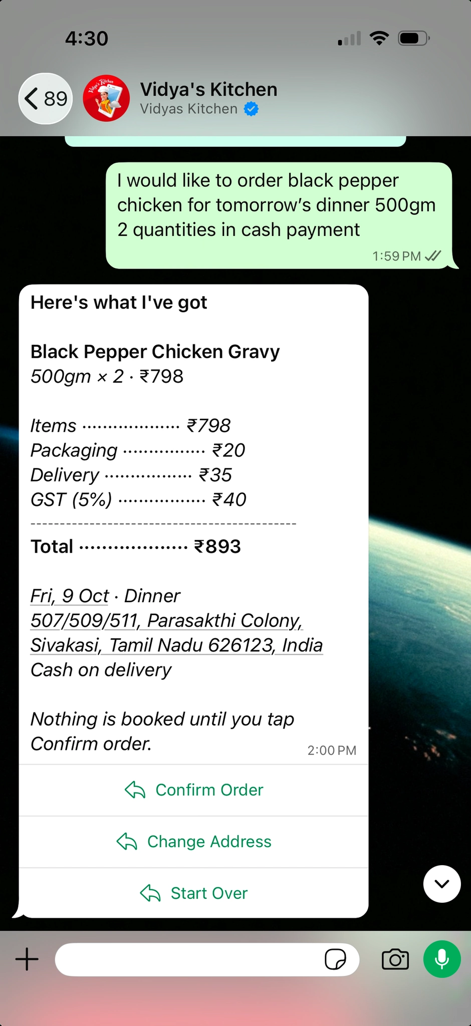
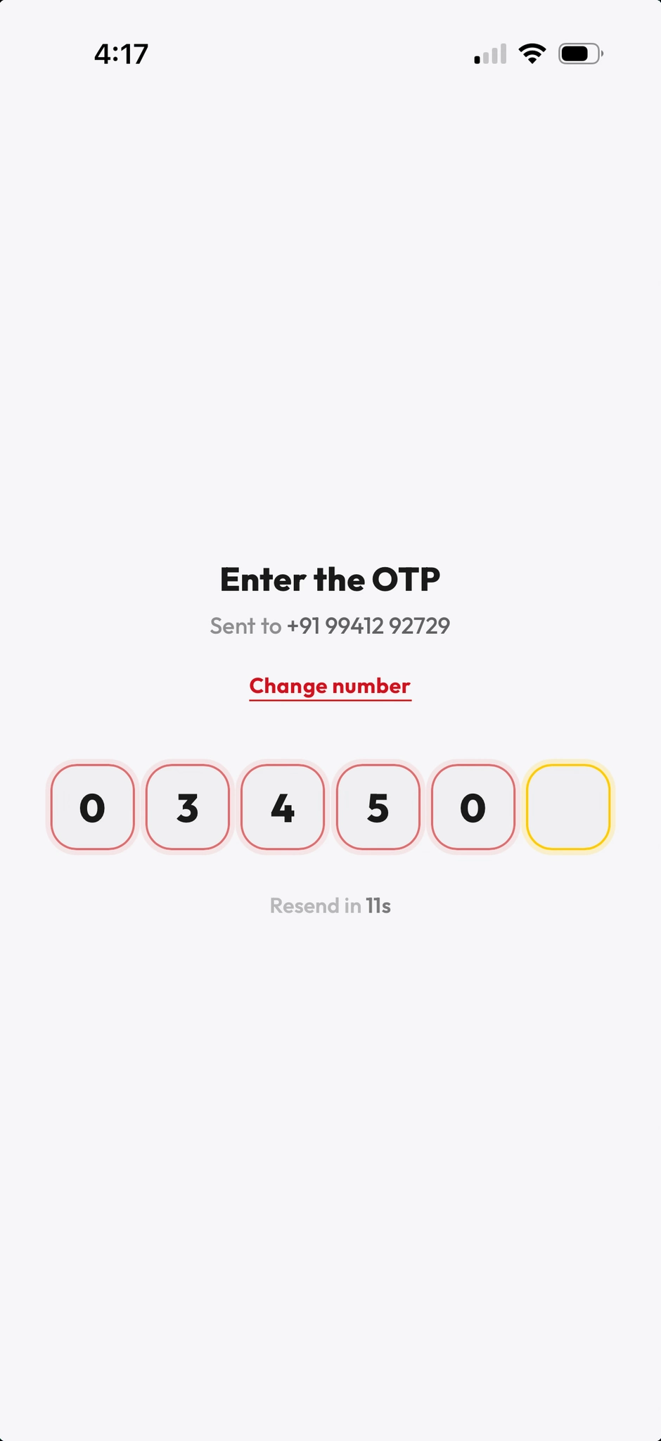
Bot with guided steps, defaults, and Razorpay in-flow
→ Fewer abandoned threads and less manual follow-up for Vidya
Pay & confirm
Goal
Pay with a familiar UPI flow and get certainty
Pain
Informal UPI “send to this number” without order linkage
Fix
Razorpay checkout tied to the bot or PWA order id
→ Reconciliation friendly for a growing kitchen
Fulfill
Goal
Get food on time; kitchen needs route clarity
Pain
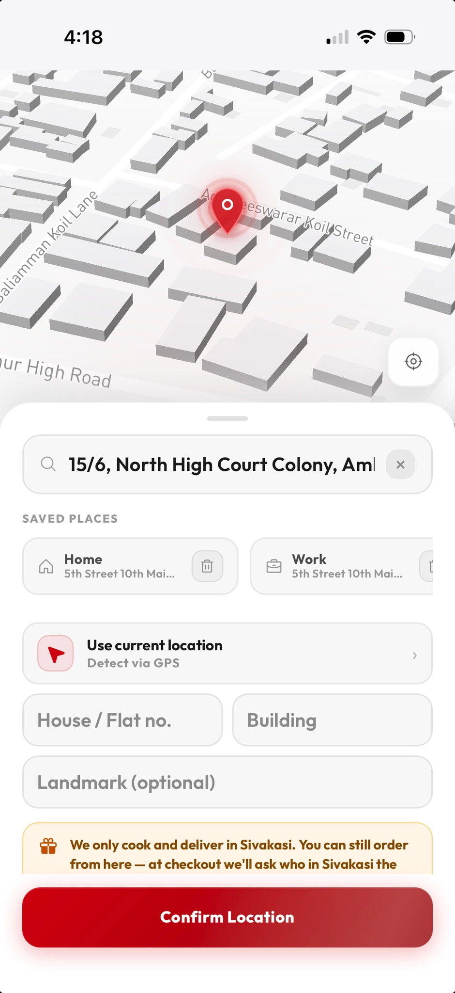
Address and slot chaos when volume grows
Fix
Dashboard with pipeline states and space for driver assignment
→ Scales beyond a handful of known customers
Return
Goal
Reorder favourites without re-explaining
Pain
No memory of last order in informal chat
Fix
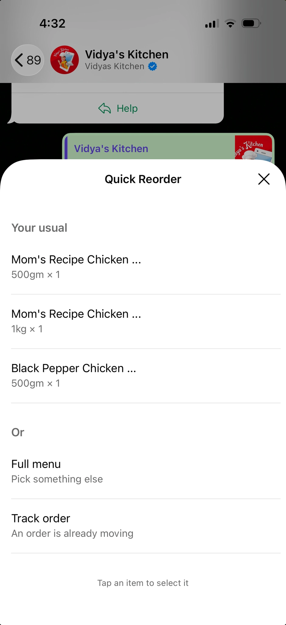
Same WhatsApp number + bot history; PWA can deepen habit later
→ Foundation for repeat revenue toward the ₹1–2L/mo goal
SWOT
Strengths
- No direct local “premium home catering app + bot” competitor in Sivakasi in this form.
- WhatsApp-first adoption matches how the city already coordinates daily life.
- Razorpay and a dashboard bring legitimacy vs. purely informal payments.
Weaknesses
- Single-kitchen supply: peak slots and quality consistency are the real caps.
- Ongoing need for content (reels, posts) to feed the top of the funnel.
- PWA and dashboard still moving toward 100% feature-complete.
Opportunities
- Double down on video-led dishes and limited batches to create urgency.
- Referral and repeat order prompts inside the bot after a great first experience.
- Lightweight loyalty or subscription thali for predictable monthly revenue.
Threats
- Generic cloud kitchens and restaurants increasing delivery app presence regionally.
- Platform and payment policy changes on Meta or WhatsApp Business APIs over time.
- Operational load if marketing outpaces kitchen capacity before hiring.
Information architecture
Marketing surface
Instagram feed & reels · Link-in-bio or ad landing · WhatsApp entry
Conversational layer
Menu by day or category · Cart & notes · Slot / address capture · Razorpay launch
PWA (customer app)
Home & featured dishes · Menu & item detail · Cart & checkout · Order history (roadmap)
Ops dashboard
Order board by status · Menu CRUD · Payouts view · Driver / route (as rolled out)
User flows
Lead → WhatsApp
Bot order + pay
PWA (parallel path)
After the user flow
WhatsApp bot — ordering entry points
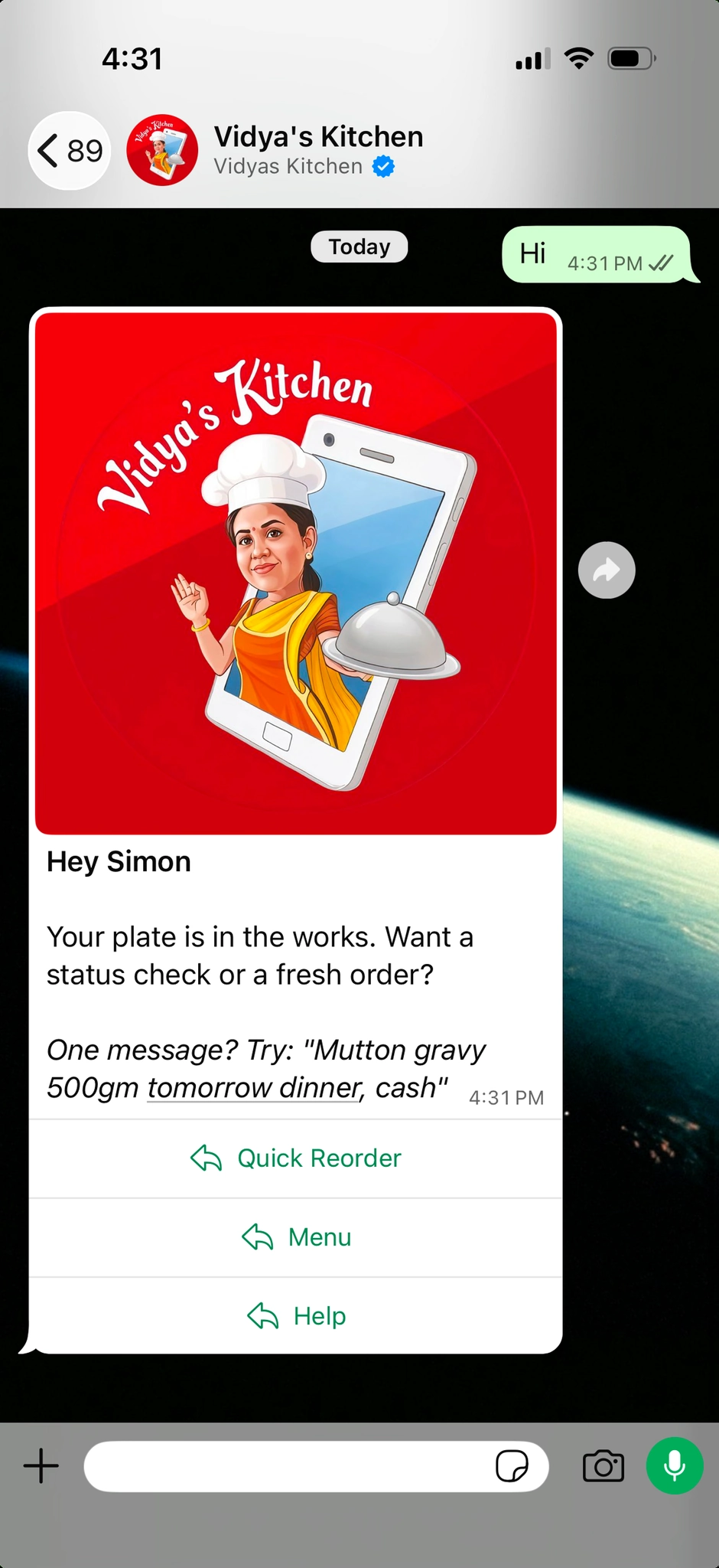
The bot is the main conversion surface for people coming from Instagram and video ads. I structured three first actions so users can get to food fast: see what’s on offer, open the PWA for a more app-like experience, or get help if something is unclear.
The three clips below are the first beats after a customer lands in chat — same phone canvas you saw in the flow above, but here as a vertical walkthrough (VK-M-1 in MP4: browse / menu on the first path).
Start from a clean menu list so the next taps stay short — categories, day’s set, and add-to-cart in chat without losing context.
Deep link or prompt to open the installable PWA for people who want a full-screen, thumb-first surface instead of a long chat thread.
Lightweight help path for slots, address, and payment hiccups so support doesn’t turn into 20 manual messages for Vidya.
PWA — desktop site
The site is a simple desktop page: no big menu. A QR opens the PWA; “Order with Vidya’s Bot” goes to WhatsApp. Below is the same loop as the case study open.
The same strip as the case-study open: a minimal desktop page, install QR for the PWA, and a clear path to “Order with Vidya’s Bot” on WhatsApp—without extra chrome.
Version 2.0
Dashboard + driver handoff (in build)
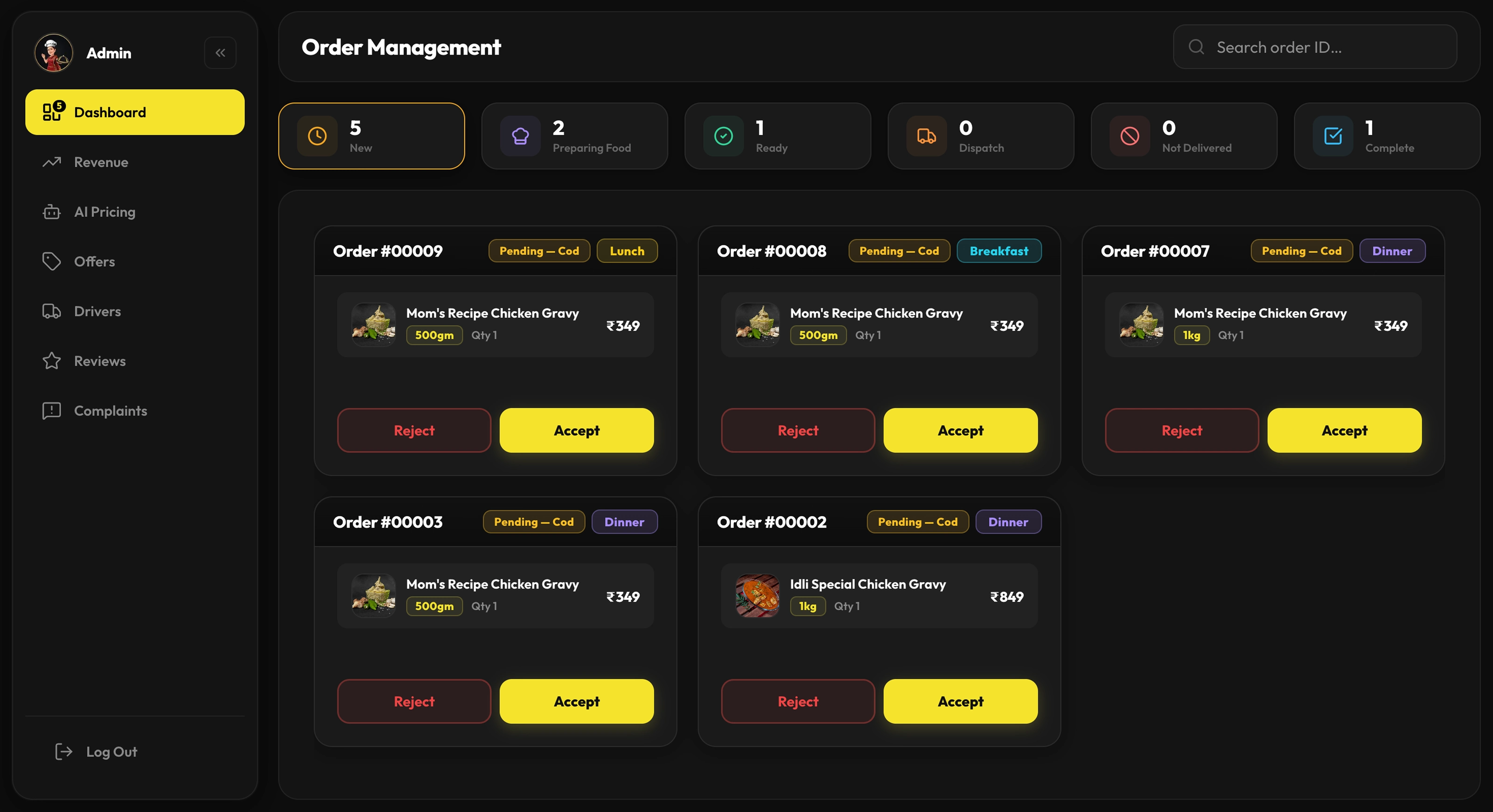
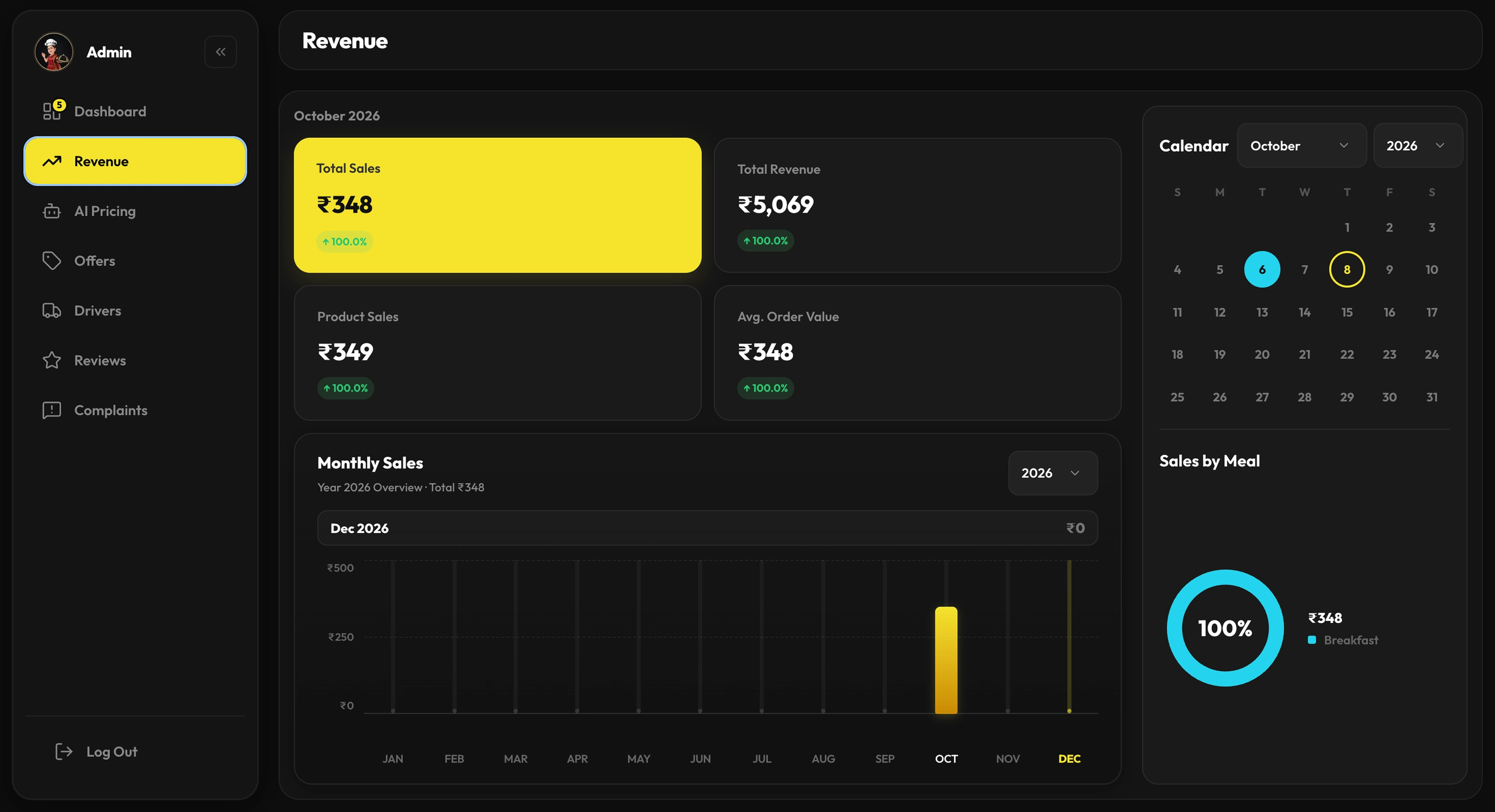
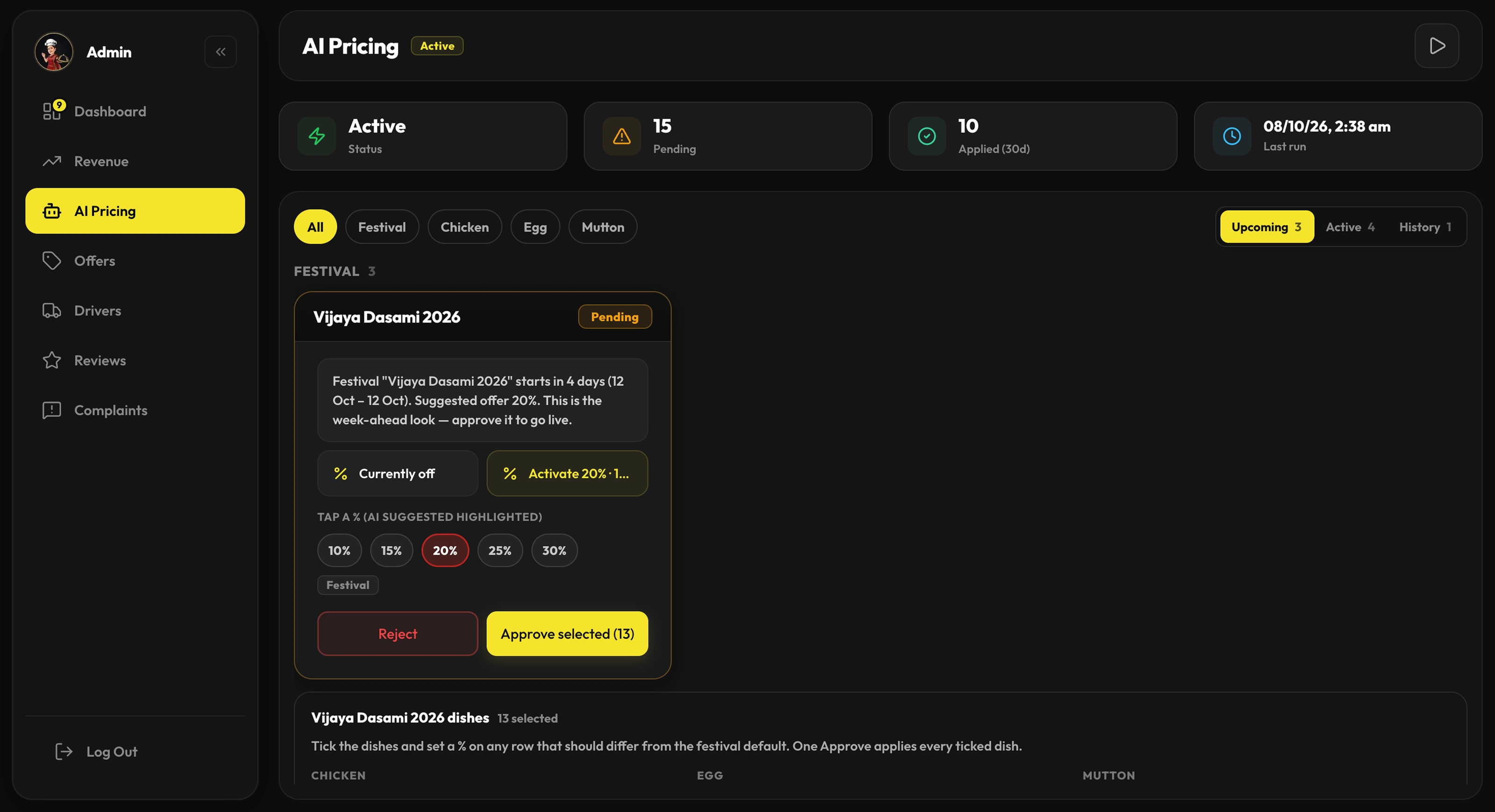
The customer site and bot (VK-1, PWA, and WhatsApp flows above) are the front of the product. The next layer is the back office: a place to run the day’s orders and a clear handoff for delivery—loading into the build as 2.0.
Ops dashboard for Vidya’s Kitchen
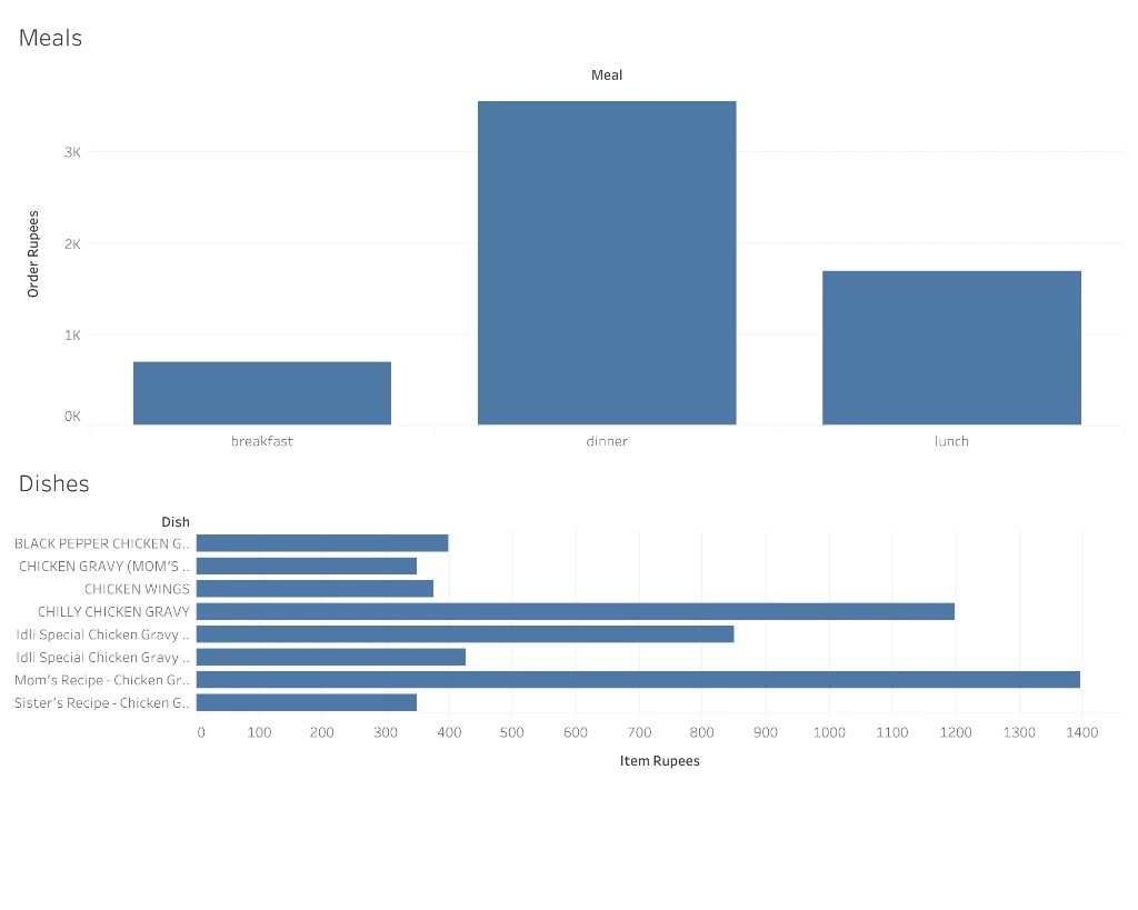
A back-office dashboard is coming together so Vidya can see orders by stage—new, in prep, out for delivery—without reconstructing the day from chat threads. The goal is simple: manage the rush, see what’s stuck, and track each order from paid to handoff in one place.
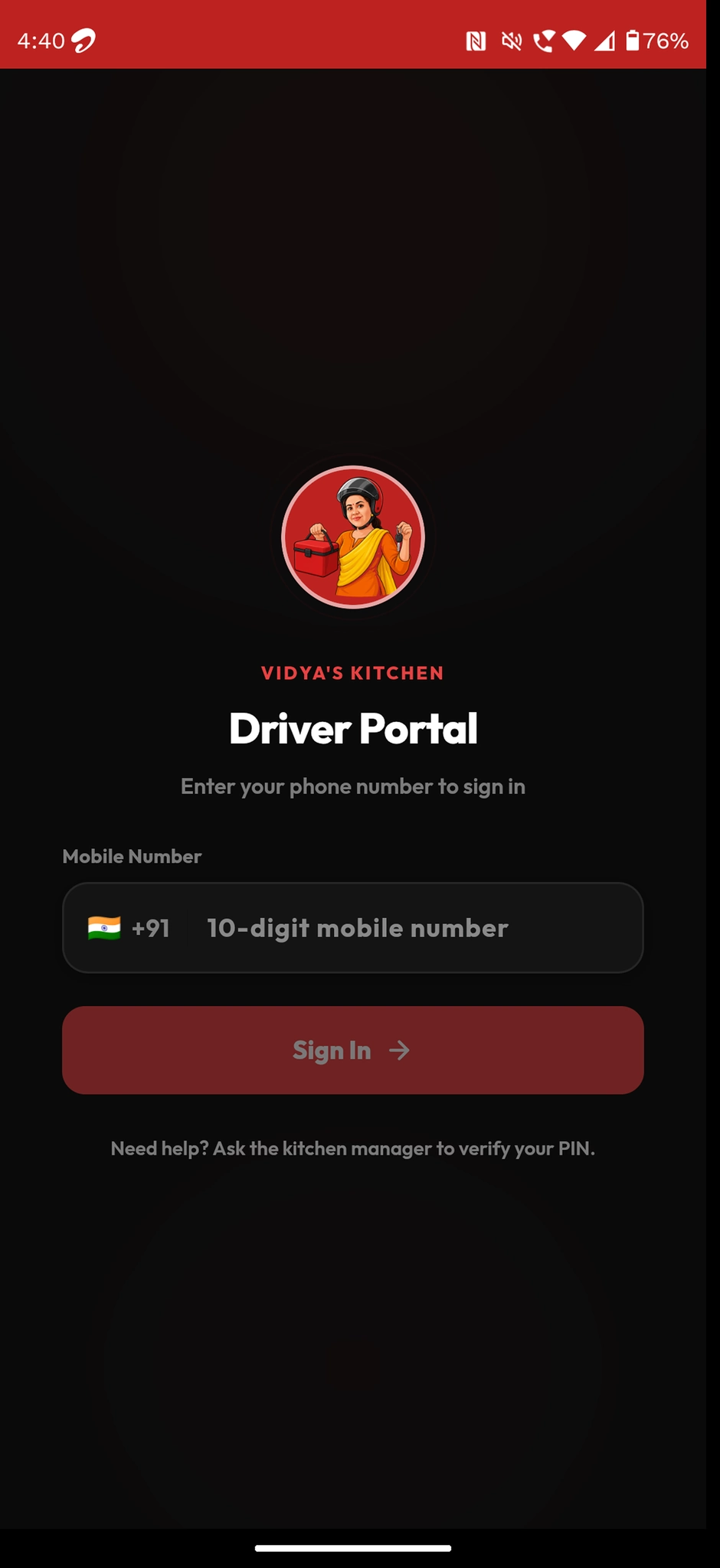
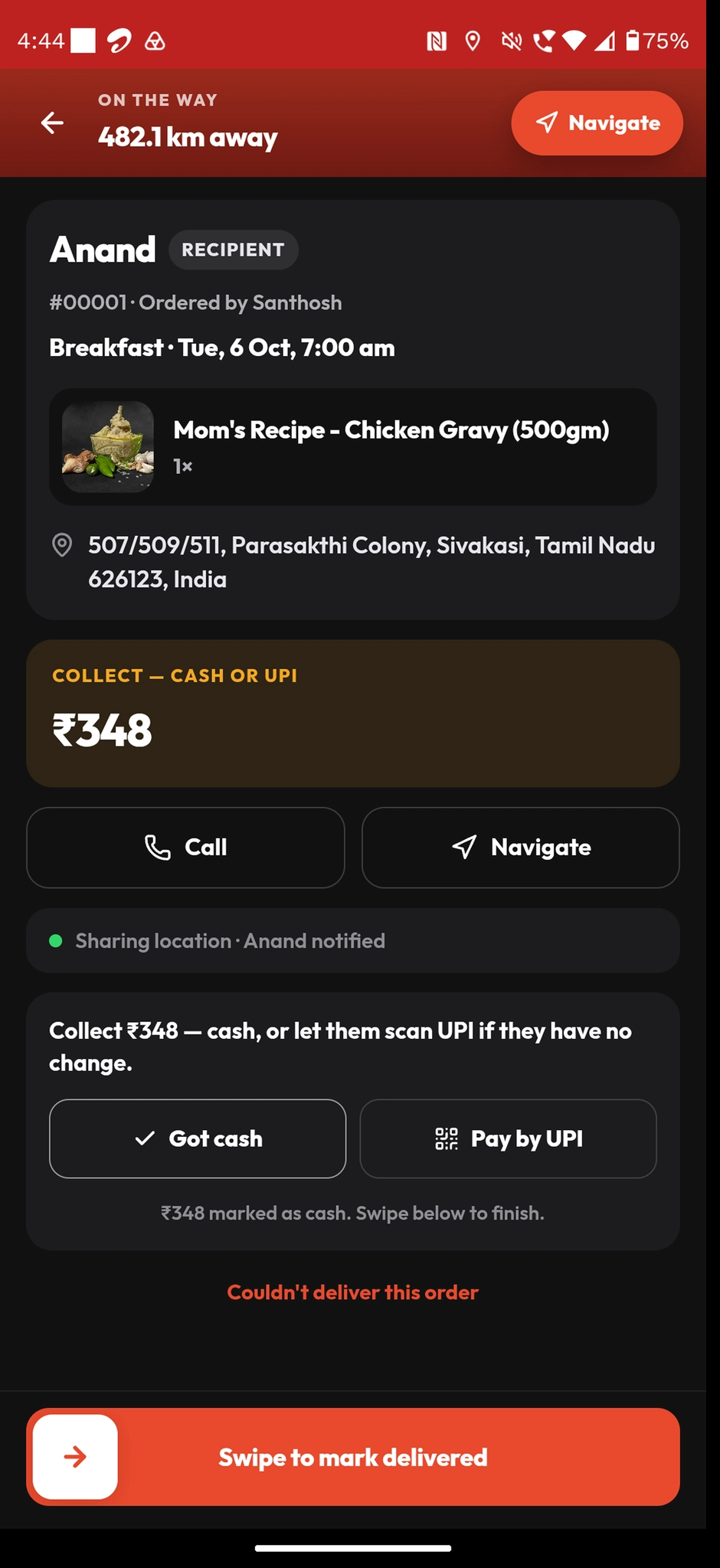
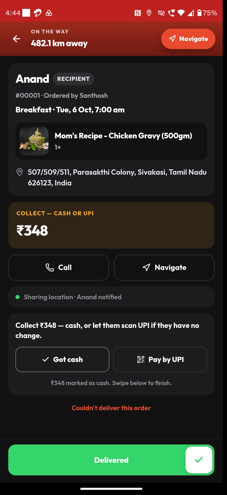
Driver app / route view
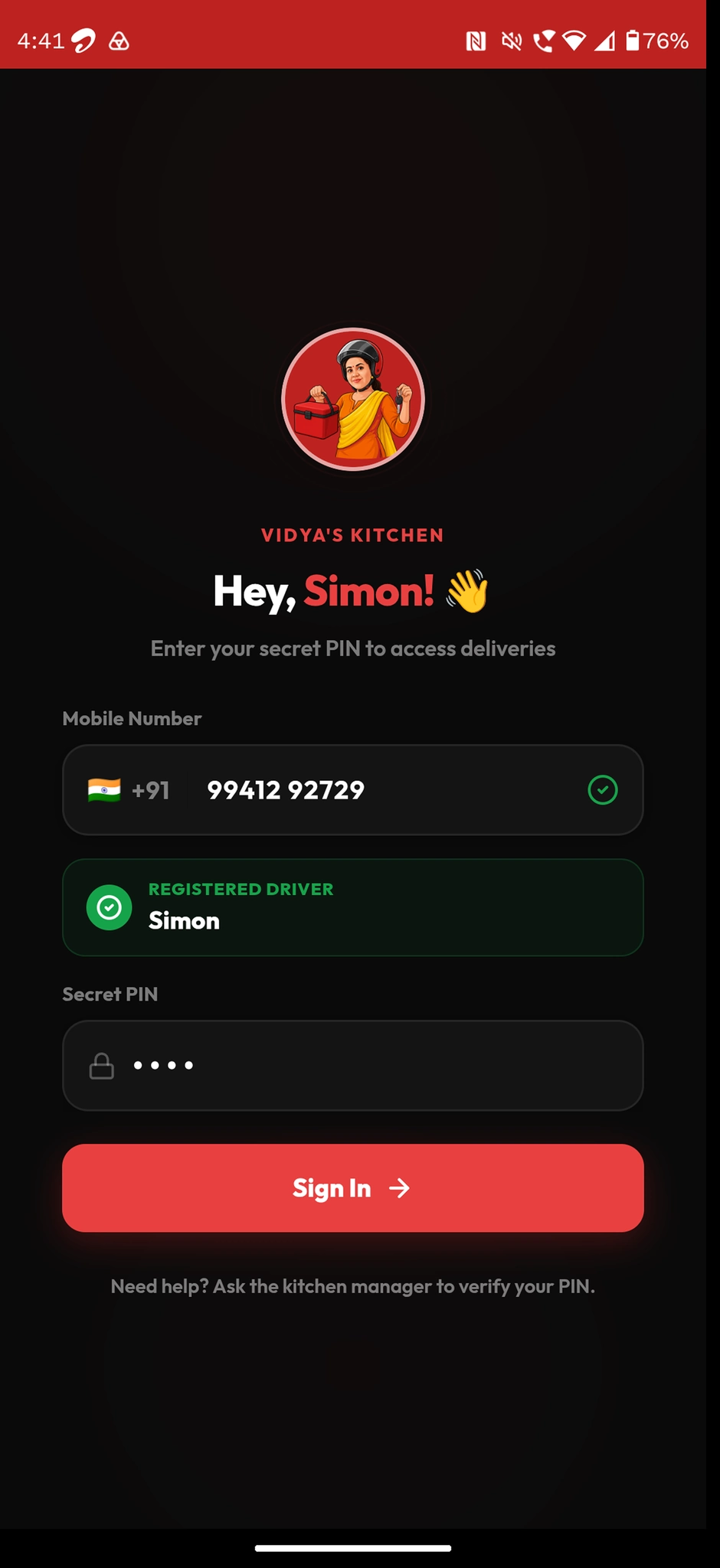
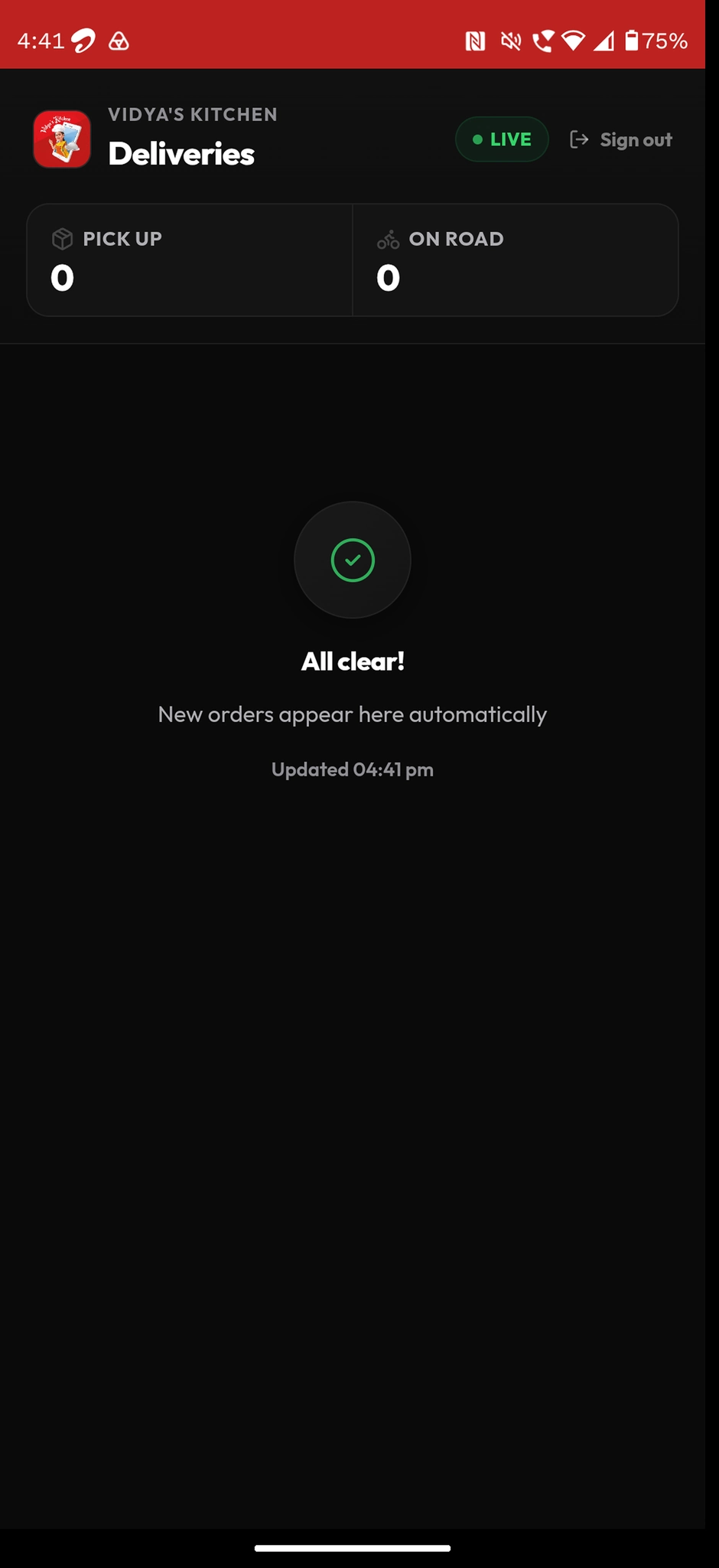
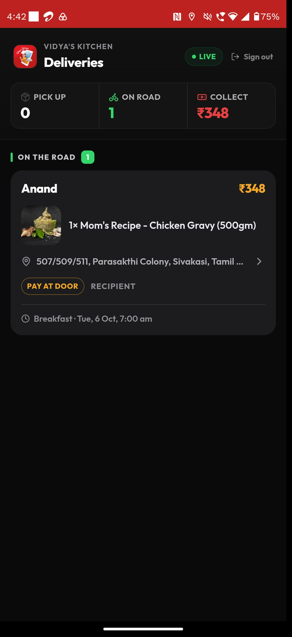
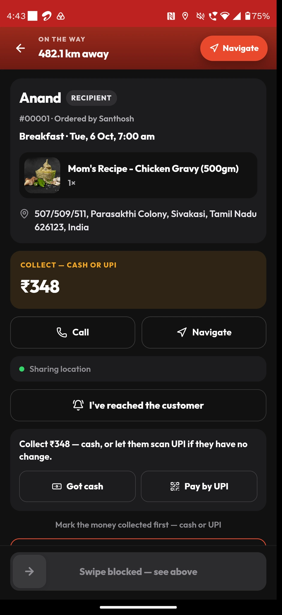
A lightweight driver surface shows who the order is for, where to go, and the status of the run: picked up from the kitchen, on the way, delivered—or flagged if something’s off. That keeps the last mile out of DMs and makes it obvious whether the customer got the right drop.
UI design system
Minimal dark landing built around a single action. The brand red commands attention, WhatsApp green owns the CTA, and food photography does all the heavy lifting — the UI deliberately disappears so the food and the order button are all anyone sees.
Colour palette
#CC1C1C
Brand red
Brand name, logo accent circle, primary identity
#1a1a1a
Dark canvas
Page background and centre landing card surface
#25D366
WhatsApp green
'Order with Vidya Bot' CTA — native WhatsApp trust colour
#FFFFFF
Pure white
All body copy, 'WELCOME TO' eyebrow, footer links
#000000
QR black
QR code container — maximum contrast for fast scanning
Typography
Brand headline
Condensed display (wide-tracked caps)
Spaced-out all-caps for 'VIDYA'S KITCHEN' — commanding presence
Eyebrow / sub-heading
Condensed sans
'WELCOME TO' in small caps — secondary hierarchy before the brand name
Body / footer
Clean sans-serif
Description text, Terms / Privacy / Refund — neutral at small sizes
Components
Design principles
- One action only — every element on the page funnels to the WhatsApp bot CTA, nothing competes
- Food as trust signal — real photography builds appetite and credibility before any UI element
- Scannable copy — short steps and obvious next actions so the flow stays light on a phone
UX outcome
Heuristic scores 1–10. Segments show relative strength across the main surfaces.
- Local fit & copy9
- WhatsApp bot path8
- PWA craft (in build)7
- Payment trust8
- Ops dashboard7
Learnings
In tier-2 India, the winning stack is often social proof + chat + UPI—meet people where they already are before you ask for an install.
Premium UI in a small business context is as much about trust and calm as it is about aesthetics.